Packaging design
//label design
Pacífico Rum


//label design
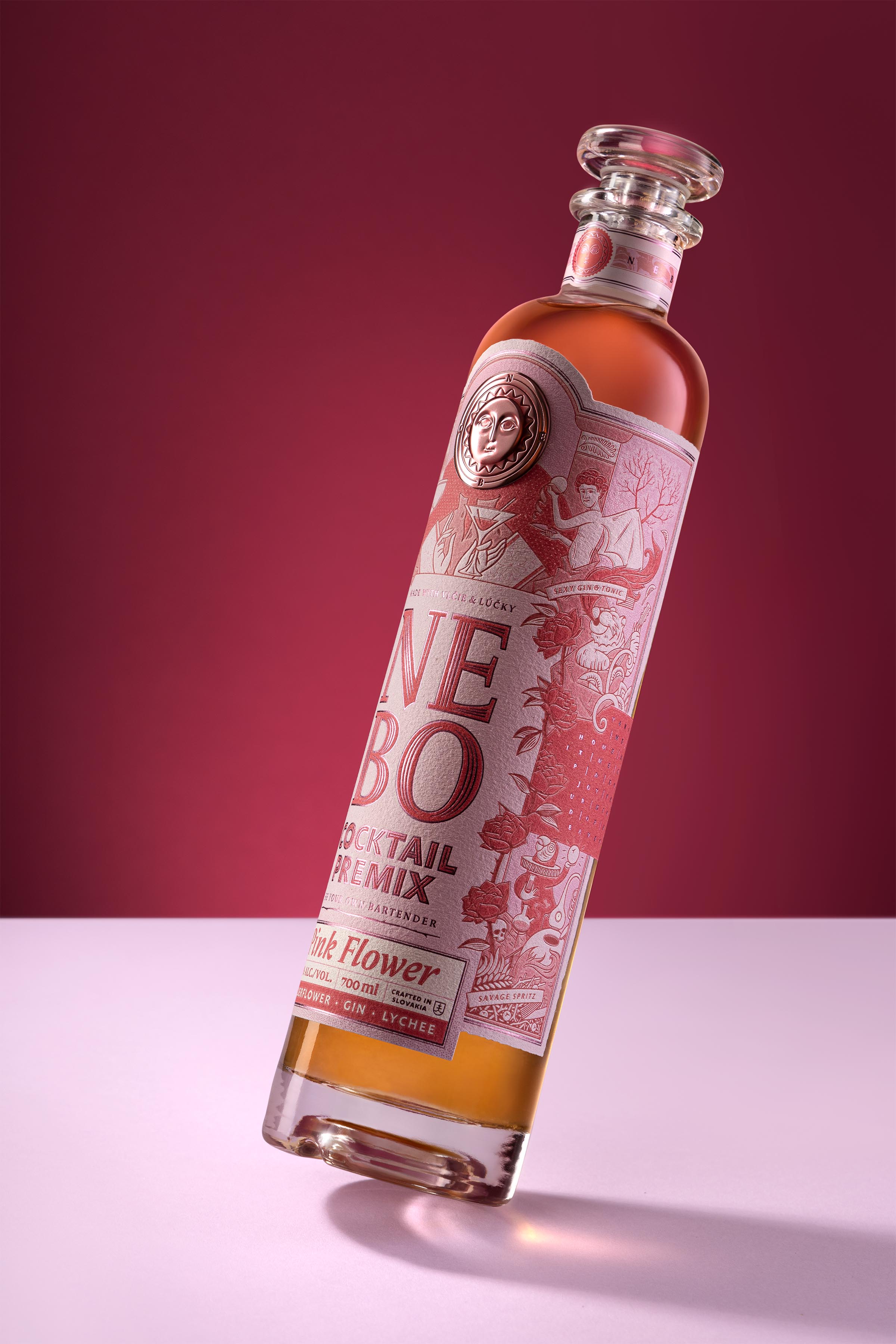
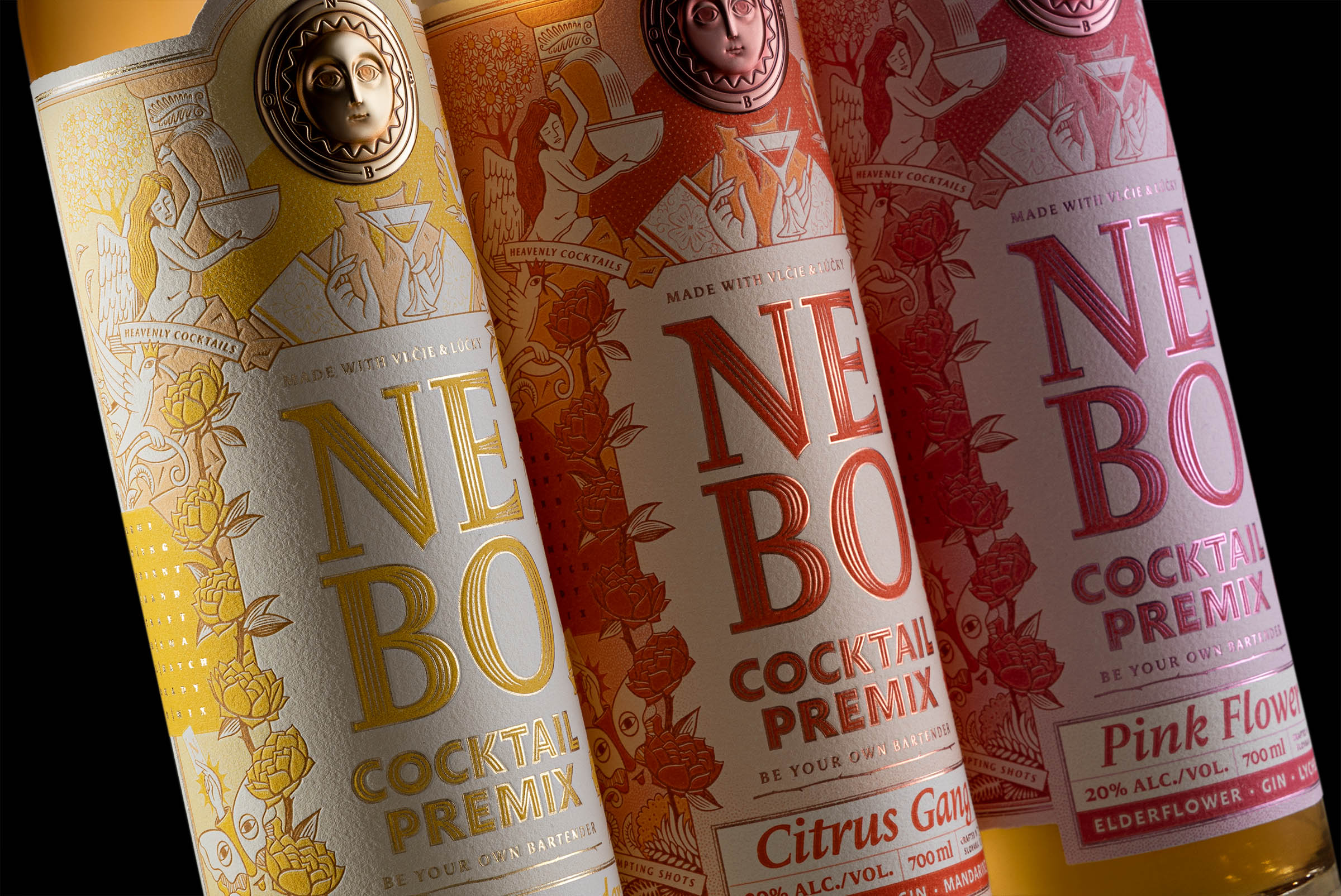
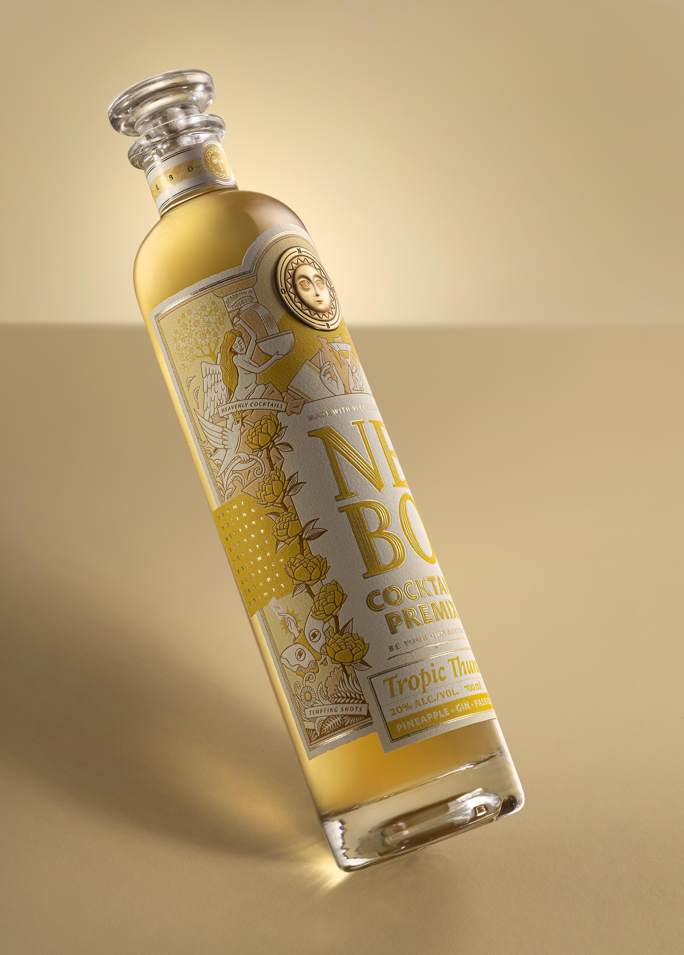
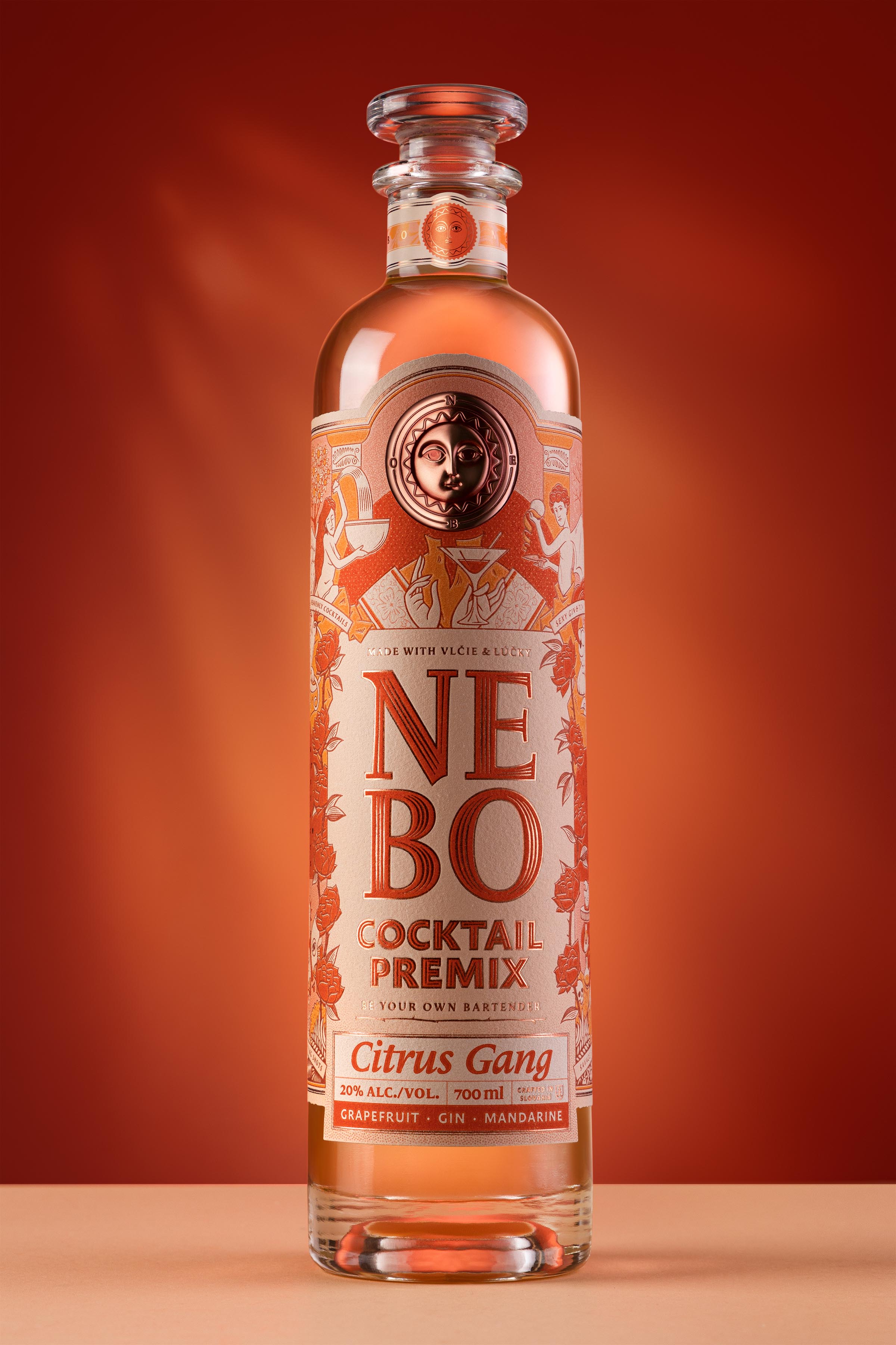
Nebo
Nebo brings together natural fruit syrups and high quality london dry gin. Name of the product, which means “heaven”, suggests what experience you should expect when tasting this product. We wanted to give a funny spin on this religious aspect of the name with iconographic illustrations, composition and typography.
//bottle design
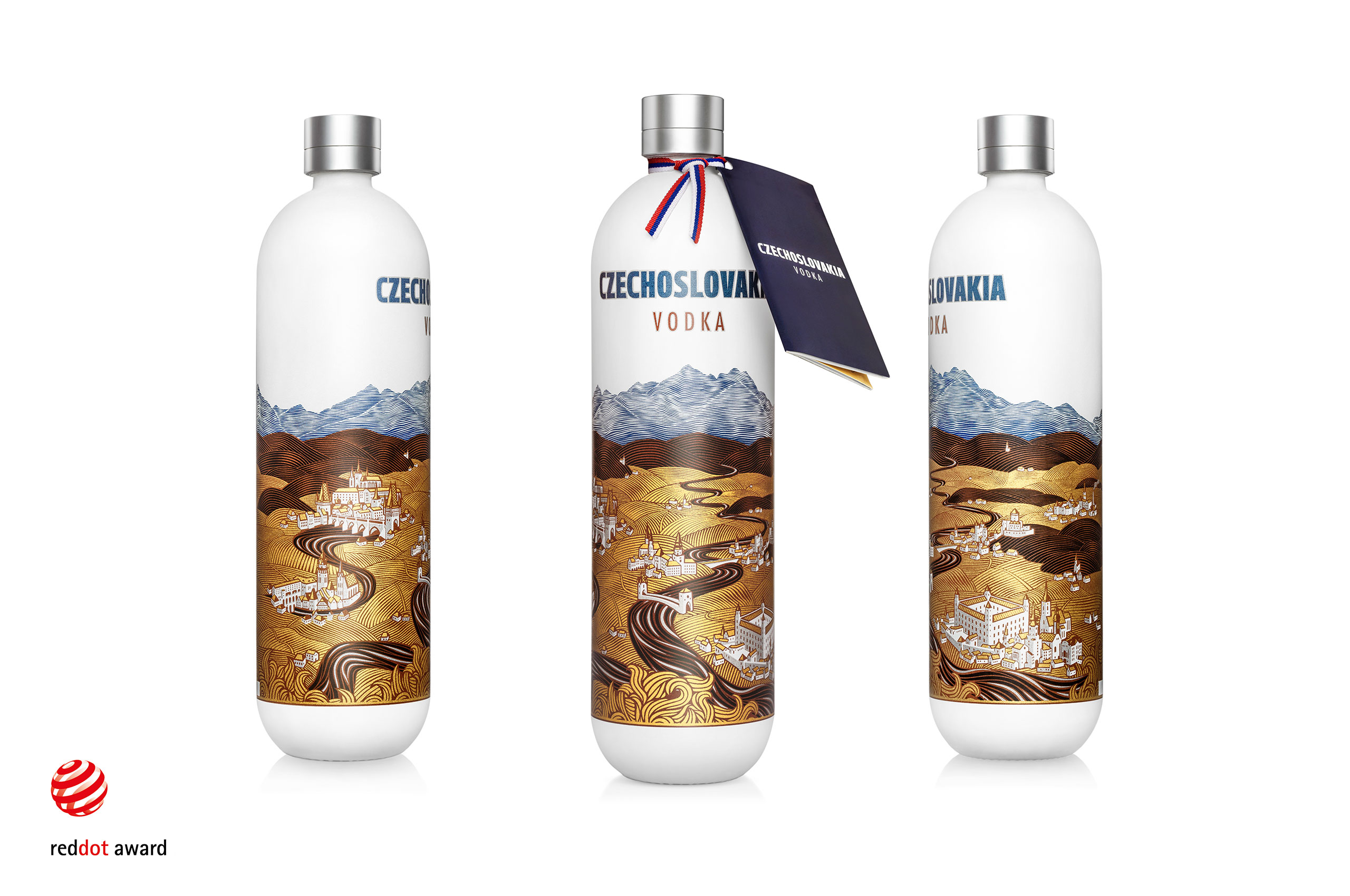
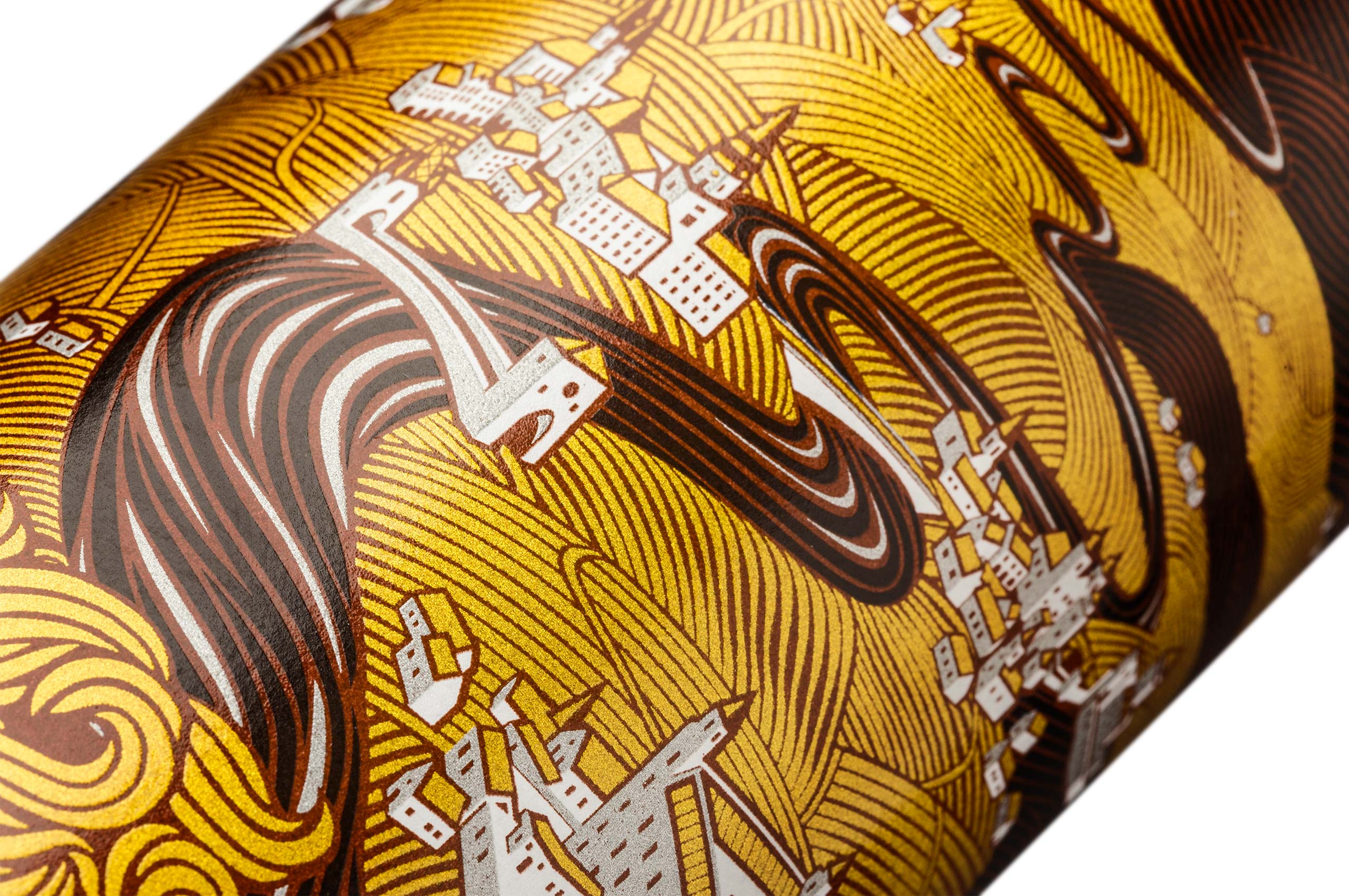
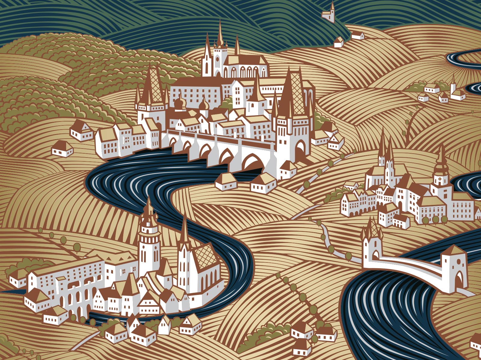
Czechoslovakia vodka
An award winning design for premium vodka brand. Czechoslovakia Vodka is a memento of brotherhood of two once united nations. Design is composed of a detailed illustration of two countries separated by Morava river. The scenery depicts golden fields, clear rivers, typical architecture of towns, deep forests, hills and mountains.


//label design
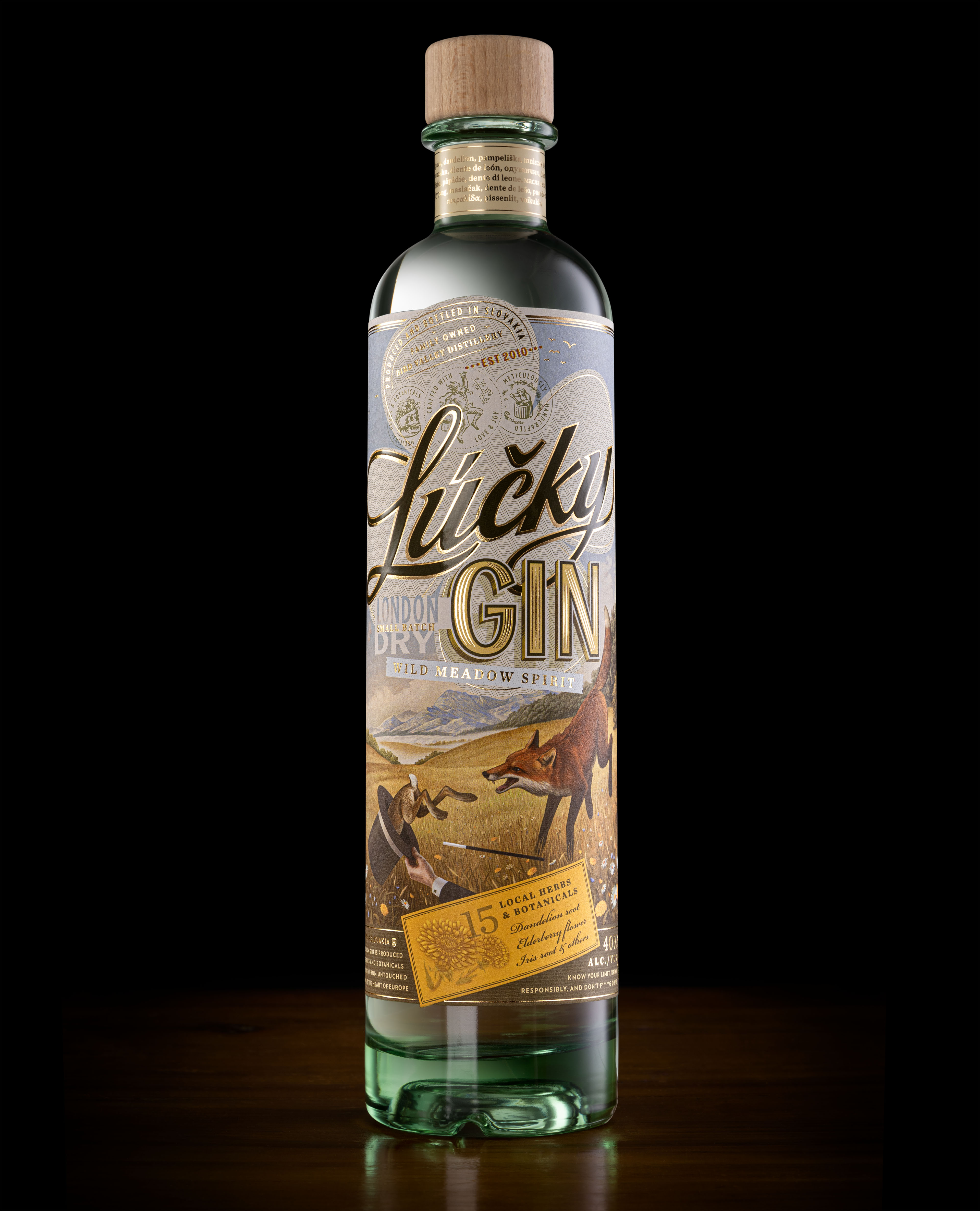
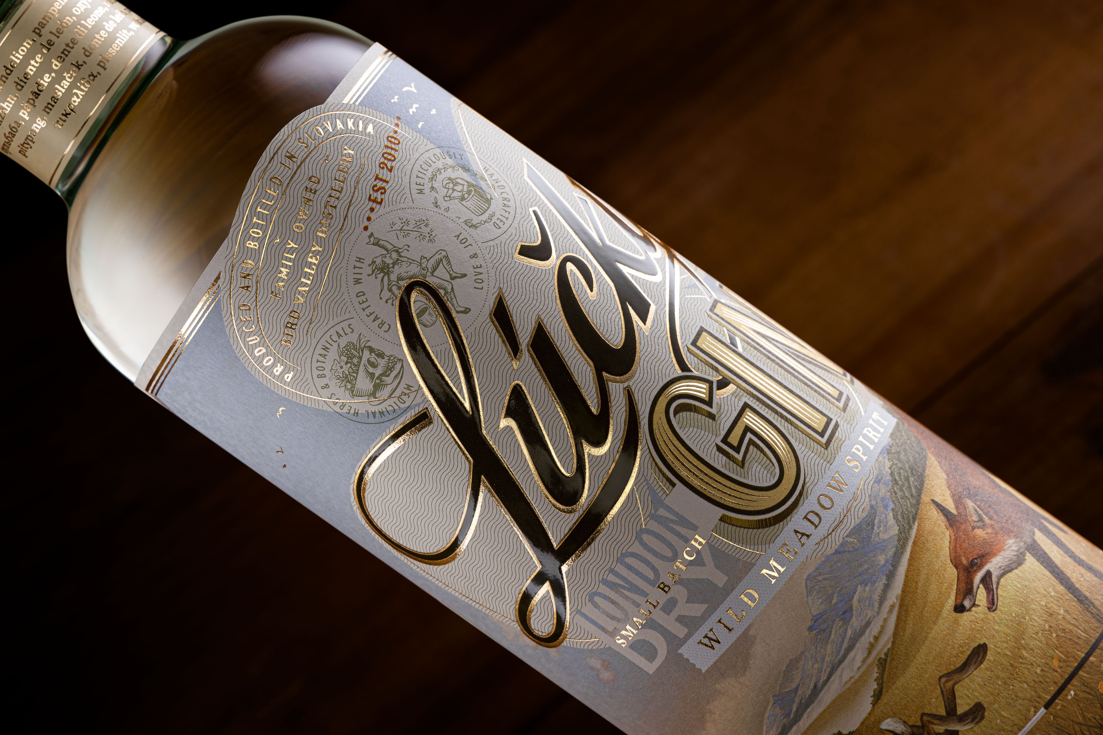
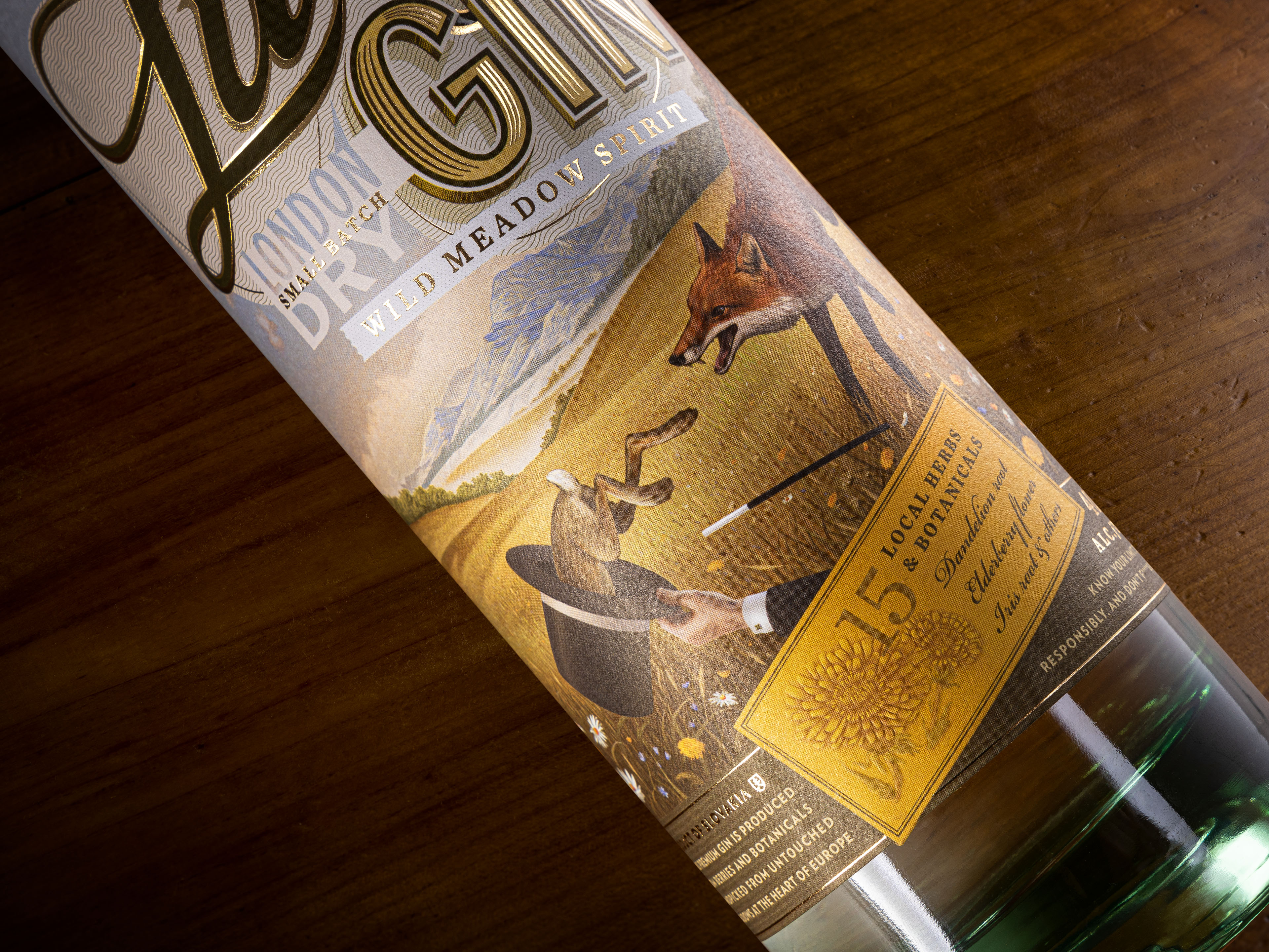
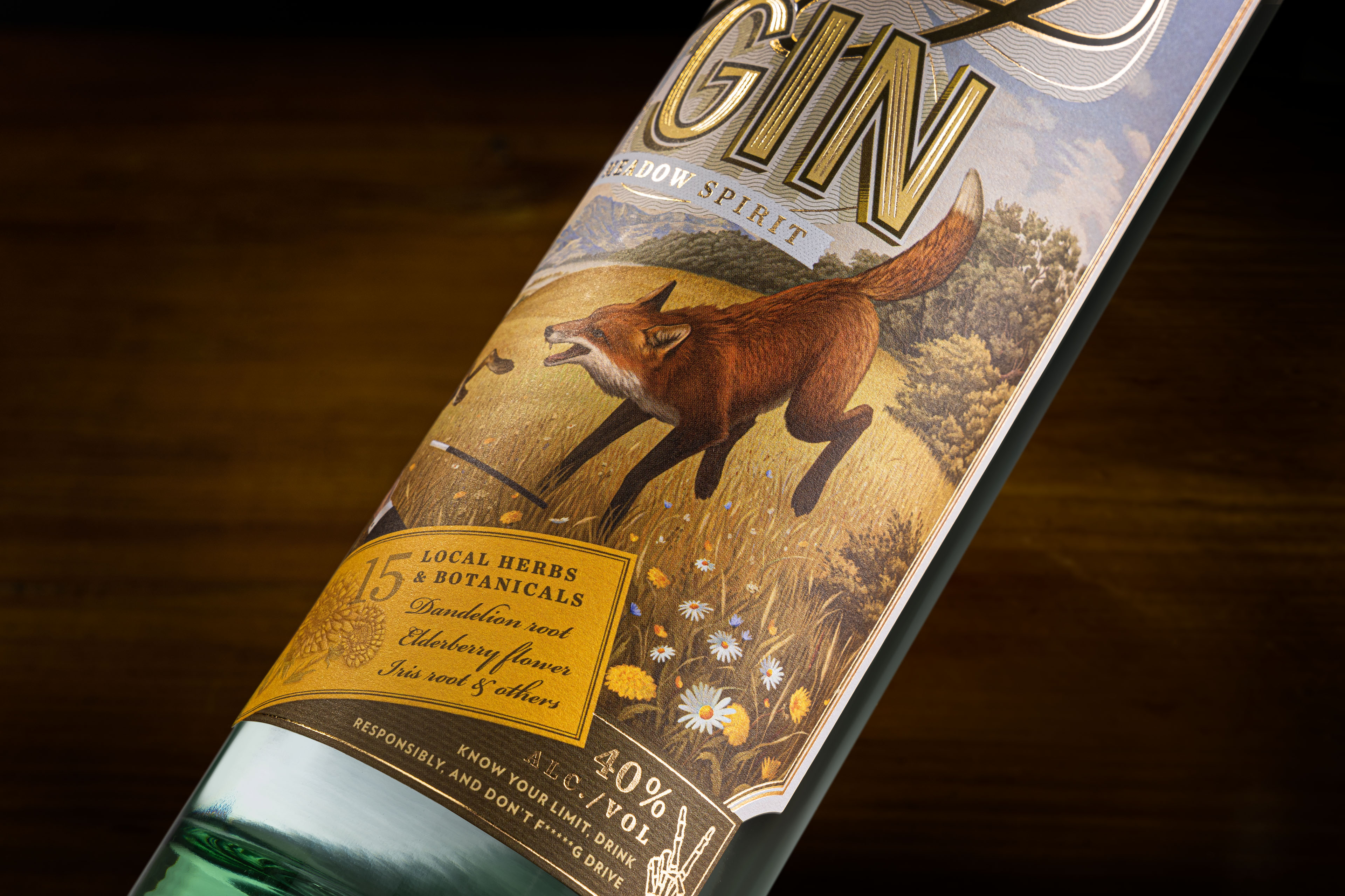
Lúčky Gin
Lúčky is a premium gin infused with handpicked herbs and botanicals from local meadows. Word „Lúčky“ means „meadows“ in the native language of the gin's origin. However, non-native speaker would read the word as „Lucky“, so we created this little play on words, where the design reflects both meanings of the word.
//gift packaging
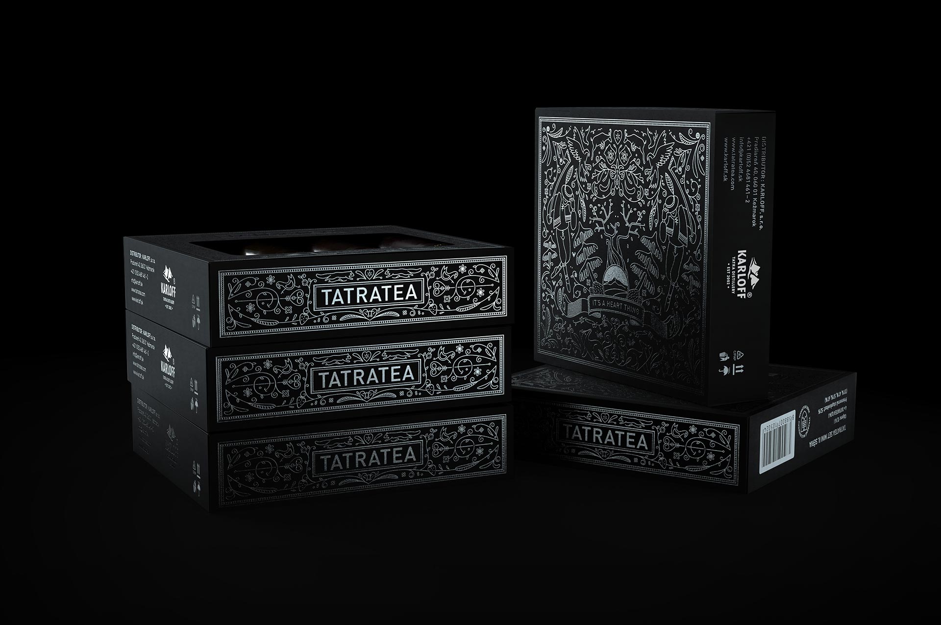
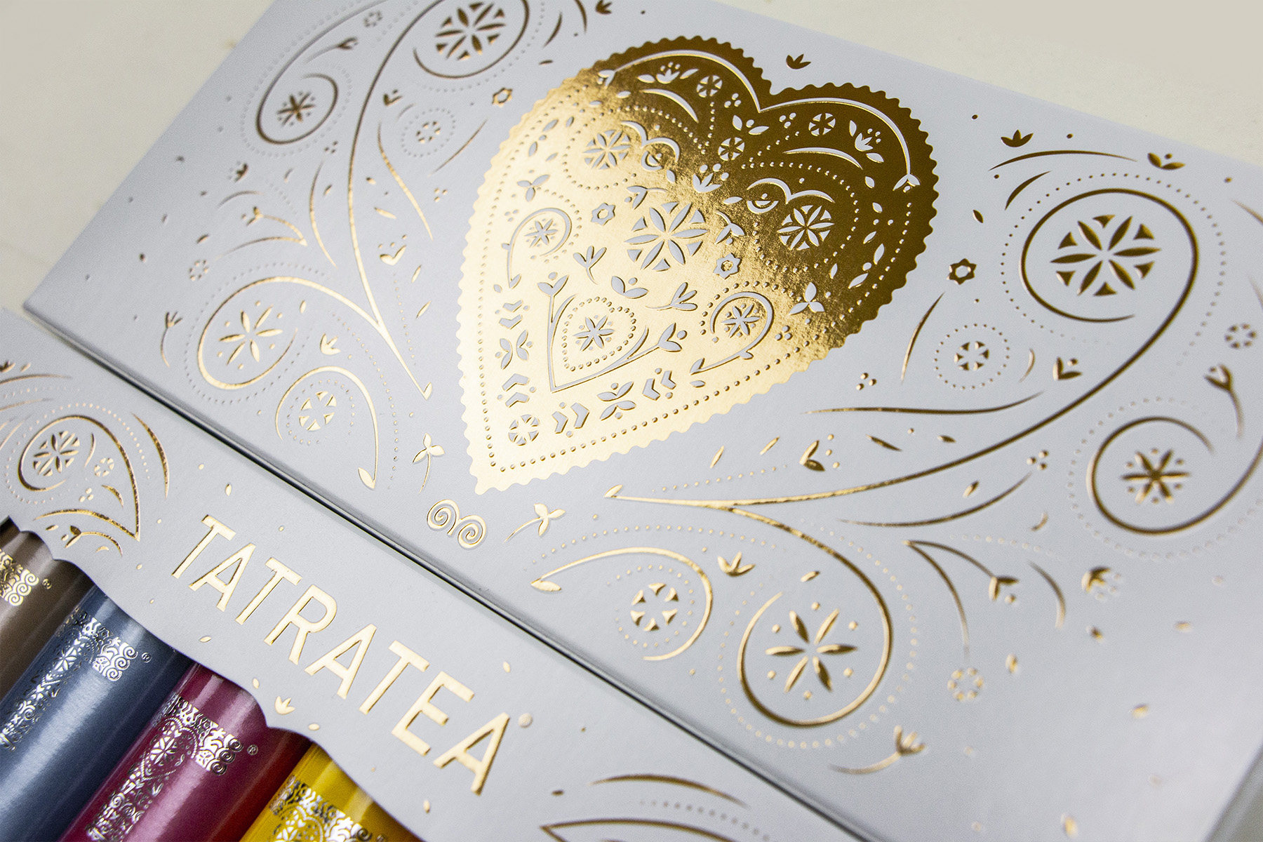
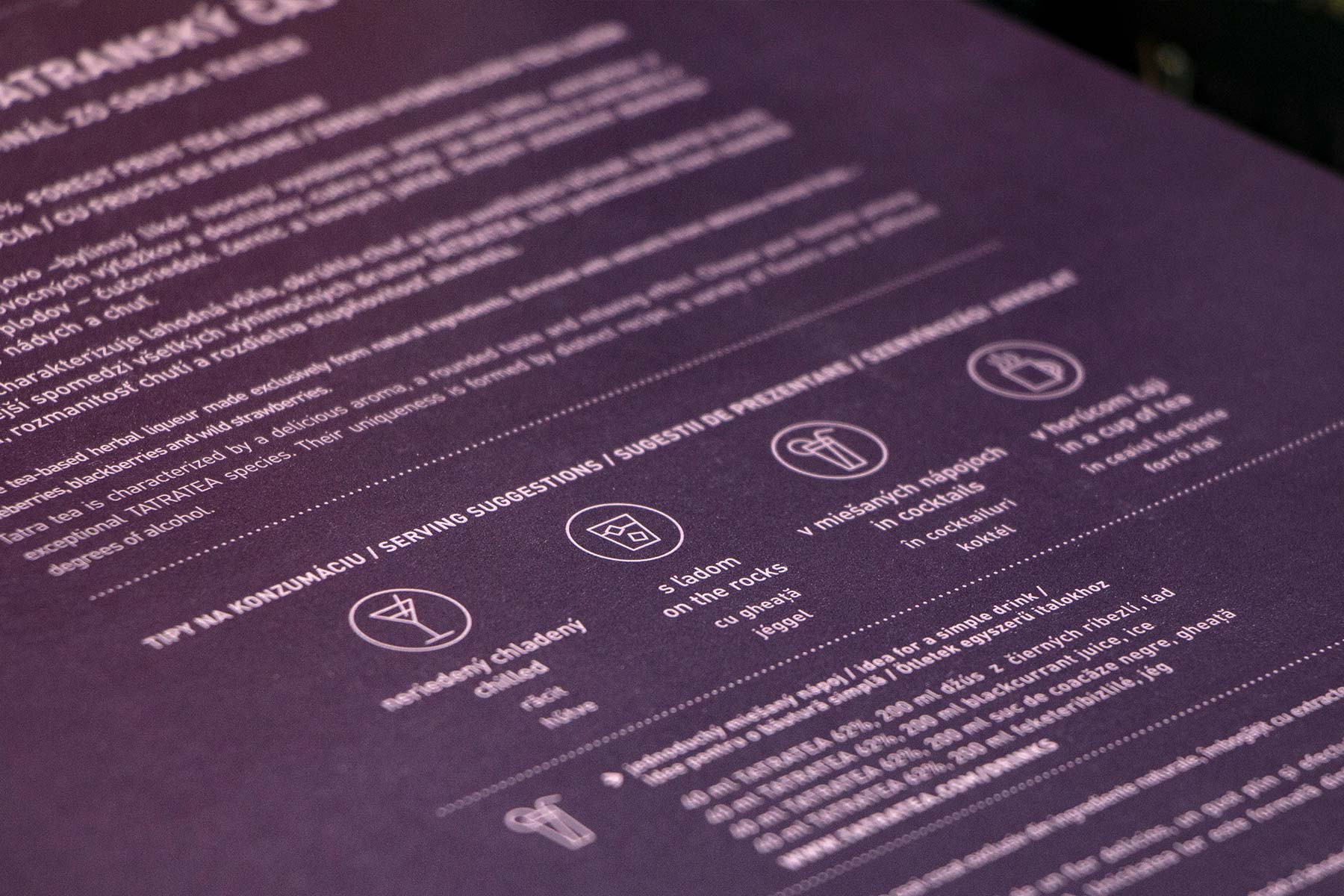
Tatratea
For the past year or so I’ve been working on packagings for TATRATEA’s line of gift products. While working on these we were trying to establish some sort of decorative design language which would work well across various applications. Resulting decorative elements are loosely based on traditional slovak folklore ornaments. Graphics on these packaging slightly differ in style which is the result of a continous search for the right ornaments for branding of the TATRATEA products.


© Brian Males 2020